
|
 |  |  |  |  |  |
 |
| |||||||

|
Welcome to Mazdaspeed Forums . You are currently viewing our boards as a guest which gives you limited access to view most discussions and access our other features. By joining our free community you will have access to post topics, communicate privately with other members (PM), respond to polls, upload content and access many other special features. Registration is fast, simple and absolutely free so please, join our community today! If you have any problems with the registration process or your account login, please contact contact us. *When you join MSF as a registered user, there will be No Ads. *Registered Members get access to the Off Topic Area of the Forum *Registered Members have an opportunity to upgrade their accounts to VIP, which brings a host of goddies for supporting MSF such as Raffles, Additional Forum Access, More PM Storage, The ability to upload more Images and many other enhancements. *Registered members also get access to the live chat box! |
 |
| | | LinkBack | Thread Tools | Search this Thread | Display Modes |
| |
 |  06-27-2010, 01:26 AM
| #1 |  |
  Join Date: Jun 2009 Location: PDX
Posts: 4,173
(View Stats)
iTrader: (32)
Rep Power: 5715   Thanks: 19,677
Thanked 11,129 Times in 1,333 Posts
Groans: 90
Groaned at 279 Times in 248 Posts
(Thread Starter) |   Not Ranked : 0 score Not Ranked : 0 score So I'm looking into doing my MAF calibration, now that the load cap fix seems to have messed up my stft & ltft's... I'm wondering if someone has an excel spreadsheet that already has their datalog turned into a graph? Although I'm not a newb to excel, I've never had to play with graphs and I'm hoping someone already has one they could send me, so I don't have to spend an hour or two reading up on it... Or do you guys who've already calibrated your MAFs just do it from the raw data? Thanks guys!
__________________  [SIGPIC][/SIGPIC] |

|  |
|
06-27-2010, 08:41 AM
| #2 | |
| Join Date: Oct 2009 Location: Gilbert, Az
Posts: 322
(View Stats)
iTrader: (0)
Rep Power: 0 Thanks: 347
Thanked 179 Times in 97 Posts
Groans: 0
Groaned at 2 Times in 2 Posts
| Not Ranked : 0 score What version of office are you using? The main "trick" that took me a little bit to figure out is how to setup values on the 2nd axis. In other words, the numbers that are super high (RPM, Fuel Pressure) need to go on the 2nd axis, otherwise you can't see what you're working with when looking at LTFT at values of -10 to +10. If you have an older version of office, click on the little graph symbol, choose XY (Scatter), choose "Scatter with data points connected by smoothed lines without markers", then click finish. (The newer versions of office are similar as well, but you go to insert, then XY scatter). Expand the graph to take up the full screen so you can see what you're doing, left click on the "highest" line in the graph (Should be RPM) then right click & say "format data series". The older versions of excel choose Axis-tab, then "secondary axis". The newer versions I think "secondary axis" is in the first tab that opens up. Doing that will move the scale over to the right. Then your next highest value will be DI fuel pressure, do the same with that. Basically keep moving over the highest values to the 2nd axis (or just delete them if you don't care about them) until the ones you want to analyze are viewable. I've seen some people do it where they get some of the values divided by 5 to scale down for readability, I'm not sure how they do that though. Maybe if someone knows how they could explain it here too. HTH |
|
| |
| The Following User Says Thank You to SJP0tato For This Useful Post: | hnda etr (06-27-2010) |
|
06-27-2010, 09:28 AM
| #3 | |
| Join Date: Oct 2008 Location: Las Vegas, NV
Posts: 1,730
(View Stats)
iTrader: (0)
Rep Power: 0 Thanks: 23,548
Thanked 10,450 Times in 794 Posts
Groans: 30
Groaned at 28 Times in 17 Posts
| Not Ranked : 0 score
Example: Column A has values of 400, 300, and 200 in A1, A2, and A3. You then go over to column B, and use the formula Code: =A1/5 Code: =A2/5 Code: =A3/5 Now column B has values of 80, 60, and 40 in cells B1, B2, and B3. Then simply use column B as the column the graph pulls its data points from.
__________________ 2008 GT MS3 - 307 WHP/338 WTQ ATP GTX2867R - HTP 3" Intake - Cobb FMIC pipes + Treadstone TR8L - Cobb Catted Turboback - Cobb XLE BPV - Denso ITV22 plugs - Corksport Injector Seals - KMD HPFP - Cobb AP - CP-E RMM - Southbend Stage 3 Enduro Clutch/Flywheel - Bilstein B8s + Swift Springs - SPC Rear Camber Arms - Hotchkis RSB - MD OCC Kit - Enkei RPF1 - Bridgestone Potenza S-04 235/40/18 1995 Miata Dunlop Direzza Star Specs 185/60/14 - Koyo 37mm radiator - NAPA blank rotors - StopTech Street Performance pads - 949 Racing XIDA CS Coilovers - IL Motorsports suspension bushings - Racing Beat FSB - 949 Endlinks | |
|
| |
|
06-27-2010, 09:51 AM
| #4 | |
| Join Date: Oct 2009 Location: Gilbert, Az
Posts: 322
(View Stats)
iTrader: (0)
Rep Power: 0 Thanks: 347
Thanked 179 Times in 97 Posts
Groans: 0
Groaned at 2 Times in 2 Posts
| Not Ranked : 0 score
| |
|
| |
|
06-27-2010, 09:16 AM
| #5 | |
| Join Date: Oct 2008 Location: Las Vegas, NV
Posts: 1,730
(View Stats)
iTrader: (0)
Rep Power: 0 Thanks: 23,548
Thanked 10,450 Times in 794 Posts
Groans: 30
Groaned at 28 Times in 17 Posts
| Not Ranked : 0 score Here you go...I made this for rgv_ms3...should still work for you you can of course feel free to modify the graph in any way you want 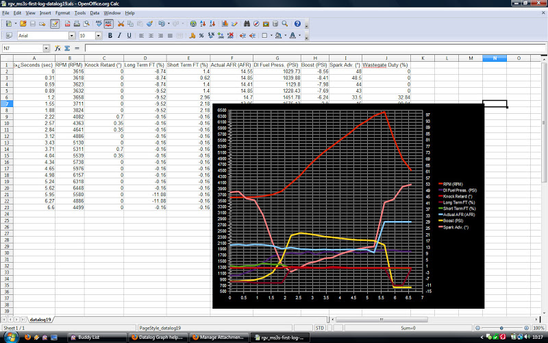
__________________ 2008 GT MS3 - 307 WHP/338 WTQ ATP GTX2867R - HTP 3" Intake - Cobb FMIC pipes + Treadstone TR8L - Cobb Catted Turboback - Cobb XLE BPV - Denso ITV22 plugs - Corksport Injector Seals - KMD HPFP - Cobb AP - CP-E RMM - Southbend Stage 3 Enduro Clutch/Flywheel - Bilstein B8s + Swift Springs - SPC Rear Camber Arms - Hotchkis RSB - MD OCC Kit - Enkei RPF1 - Bridgestone Potenza S-04 235/40/18 1995 Miata Dunlop Direzza Star Specs 185/60/14 - Koyo 37mm radiator - NAPA blank rotors - StopTech Street Performance pads - 949 Racing XIDA CS Coilovers - IL Motorsports suspension bushings - Racing Beat FSB - 949 Endlinks |
|
| |
| The Following User Says Thank You to Cataphract_40 For This Useful Post: | hnda etr (06-27-2010) |
|
06-27-2010, 11:37 AM
| #6 | |
| Join Date: Jun 2009 Location: PDX
Posts: 4,173
(View Stats)
iTrader: (32)
Rep Power: 5715 Thanks: 19,677
Thanked 11,129 Times in 1,333 Posts
Groans: 90
Groaned at 279 Times in 248 Posts
(Thread Starter) | Not Ranked : 0 score Thanks guys! Edit - FYI I'm using excel '07
__________________ [SIGPIC][/SIGPIC] |
|
| |
|
06-28-2010, 12:33 PM
| #7 | |
| Join Date: Jun 2009 Location: PDX
Posts: 4,173
(View Stats)
iTrader: (32)
Rep Power: 5715 Thanks: 19,677
Thanked 11,129 Times in 1,333 Posts
Groans: 90
Groaned at 279 Times in 248 Posts
(Thread Starter) | Not Ranked : 0 score
My log is about 26 seconds, and if I just cut-n-paste my data over yours, it wasn't shown all 26 secs... I went into the Select Data properties, but I didn't see the seconds/time in there...
__________________ [SIGPIC][/SIGPIC] | |
|
| |
|
06-28-2010, 02:10 PM
| #8 | |
| Join Date: Oct 2008 Location: Las Vegas, NV
Posts: 1,730
(View Stats)
iTrader: (0)
Rep Power: 0 Thanks: 23,548
Thanked 10,450 Times in 794 Posts
Groans: 30
Groaned at 28 Times in 17 Posts
| Not Ranked : 0 score Here's the info you need. The Excel Chart and its Data Range See the colored boxes? You want to drag & drop that little square in the bottom right hand corner of the colored box so that all your data is covered on the graph. Example: You start out with this: 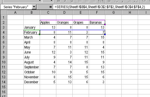 and end up with this: 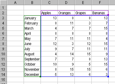
__________________ 2008 GT MS3 - 307 WHP/338 WTQ ATP GTX2867R - HTP 3" Intake - Cobb FMIC pipes + Treadstone TR8L - Cobb Catted Turboback - Cobb XLE BPV - Denso ITV22 plugs - Corksport Injector Seals - KMD HPFP - Cobb AP - CP-E RMM - Southbend Stage 3 Enduro Clutch/Flywheel - Bilstein B8s + Swift Springs - SPC Rear Camber Arms - Hotchkis RSB - MD OCC Kit - Enkei RPF1 - Bridgestone Potenza S-04 235/40/18 1995 Miata Dunlop Direzza Star Specs 185/60/14 - Koyo 37mm radiator - NAPA blank rotors - StopTech Street Performance pads - 949 Racing XIDA CS Coilovers - IL Motorsports suspension bushings - Racing Beat FSB - 949 Endlinks |
|
| |
| The Following User Says Thank You to Cataphract_40 For This Useful Post: | hnda etr (06-28-2010) |
|
06-28-2010, 02:15 PM
| #9 | |
| Banned 
Join Date: Jun 2008 Location: misery
Posts: 14,702
(View Stats)
iTrader: (7)
Rep Power: 0 Thanks: 11,510
Thanked 18,751 Times in 5,169 Posts
Groans: 1,940
Groaned at 886 Times in 632 Posts
| Not Ranked : 0 score fuck you roy | |
|
| |
| The Following User Says Thank You to phillyb For This Useful Post: | hnda etr (06-28-2010) |
|
06-28-2010, 02:25 PM
| #10 | |
| Join Date: Jun 2009 Location: PDX
Posts: 4,173
(View Stats)
iTrader: (32)
Rep Power: 5715 Thanks: 19,677
Thanked 11,129 Times in 1,333 Posts
Groans: 90
Groaned at 279 Times in 248 Posts
(Thread Starter) | Not Ranked : 0 score
__________________ [SIGPIC][/SIGPIC] | ||
|
| |
| The Following User Says Thank You to hnda etr For This Useful Post: | phillyb (06-28-2010) |
|
07-07-2010, 06:13 AM
| #11 | |
| Eth/Meth Junkie  Join Date: Mar 2008 Location: Columbus, OH
Posts: 2,998
(View Stats)
iTrader: (1)
Rep Power: 2957 Thanks: 1,846
Thanked 5,488 Times in 1,740 Posts
Groans: 3
Groaned at 3 Times in 3 Posts
| Not Ranked : 0 score Here is the format I use to easily/quickly create graphs of the following format: Just copy and paste the data in. Add/remove rows as appropriate... I just copy the tab over and over and keep dumping the data straight in. All I have to do is alter the x-axis to line up with the proper time in the log for a good display.
__________________ 08 MS3: ATP GTX3071 at 26PSI  , AEM Dryflow 21-2147DK, CP-E 3.25'' MAF, CP-E Nviscid TIP, PG FMIC piping with Treadstone TR11 core, Cobb BPV, Ported IM, PG v1 manifold, CP-E catted DP, CNT CBE, KMD v2, Grimspeed EBCS, Alkycontrol Meth injection (M10 with 100% meth), E40 fuel, Cobb AP (ATR= WIN), ACT ZX4-HDSS, 3-Bar MAP, JBR RSB, and CP-E 60 Duro Engine Mount Set. (297.3WHP/366.9WTQ - on K04, 469.2WHP/420.7WTQ - on GTX3071) , AEM Dryflow 21-2147DK, CP-E 3.25'' MAF, CP-E Nviscid TIP, PG FMIC piping with Treadstone TR11 core, Cobb BPV, Ported IM, PG v1 manifold, CP-E catted DP, CNT CBE, KMD v2, Grimspeed EBCS, Alkycontrol Meth injection (M10 with 100% meth), E40 fuel, Cobb AP (ATR= WIN), ACT ZX4-HDSS, 3-Bar MAP, JBR RSB, and CP-E 60 Duro Engine Mount Set. (297.3WHP/366.9WTQ - on K04, 469.2WHP/420.7WTQ - on GTX3071)  Last edited by cld12pk2go; 07-08-2010 at 05:00 AM. |
|
| |
| The Following User Says Thank You to cld12pk2go For This Useful Post: | hnda etr (07-07-2010) |
|
07-07-2010, 01:14 PM
| #12 | |
| Join Date: Jun 2009 Location: PDX
Posts: 4,173
(View Stats)
iTrader: (32)
Rep Power: 5715 Thanks: 19,677
Thanked 11,129 Times in 1,333 Posts
Groans: 90
Groaned at 279 Times in 248 Posts
(Thread Starter) | Not Ranked : 0 score
__________________ [SIGPIC][/SIGPIC] | |
|
| |
|
07-07-2010, 01:50 PM
| #13 | |
| Eth Fiend Join Date: May 2010 Location: Auburn Hills, MI
Posts: 6,947
(View Stats)
iTrader: (10)
Rep Power: 11231 Thanks: 14,868
Thanked 21,735 Times in 5,875 Posts
Groans: 7
Groaned at 17 Times in 14 Posts
| Not Ranked : 0 score Pivot Charts are MUCH easier to use. I've been bitching about how people should learn how to graph, so I'm going to make a short tutorial. Edit: I just wrote this... I do lots of data analysis, besides datalogs from my car, so 'pivoting' data becomes very important and it saves a ton of time. Since the datalogs come in a nice table form, we can easily chart these against time, to see what our cars are doing. I log with the AP, but this applies to just about anything in table form. 1) Open your log with Excel 2007. If you want to save this work, you will need to save it as a .xlsx 2)Since some of the fields are huge compared to others (like RPM), I add a couple more columns to scale these down. I usually divide RPM by 100 and Calc'd Load by 10, for example. Name these fields something that is easily identified and is not the same as other field names. [Field names are the column headers.] Here's a screenshot of my new fields and the formula. It just references the original column, and divides by whatever number you feel like. Scaling by a factor of 10 is nice and multiple y-axis values can be confusing. 3) After you have the extra columns fixed up, click into one cell in your data table, go to the 'Insert' tab on the Excel Ribbon. There is a button on the far left that says 'Pivot Table'. Click the down arrow just below it, and select 'Pivot Chart'. Here's a screenshot of the button in the upper left. 4) Once you click 'Pivot Chart', you will get a dialog box asking you about the data set (which should contain your entire data table). This will also give you the option to insert the pivot chart onto the same worksheet, or a new worksheet. I prefer working from a new worksheet. Click 'OK' if everything looks right. 5) You now have a blank pivot chart on a new worksheet! On the right side of the worksheet, you should have two extra windows, within the worksheet: Pivot Chart Filter Pane, and Pivot Table Field List. Get rid of the pivot chart filter pane (the second window, next to your pivot table field list); just click the x in that window. You won't be using this, and it just covers up some nice chart area. Here's a screenshot of the newly inserted pivot chart: 6) Now that we have the extra bs out of there, we can start setting up the chart that we will actually use. At this point, you can resize the chart pane. As you add more things to the chart area, excel will resize the pane to random sizes, so I wait until I have a few things in there. The first thing you want to do is set the x-axis to be 'Time'. Simply grab 'Time' from the list on the right (this is your field list), and drag it into the bottom left area labeled "Axis Fields (Categories)". Here's a screenshot with 'Time' added to the 'Axis Fields' box: 7) Now we can chart stuff!!! Anything that you want to see in the chart pane, (that is: A graphical representation), just drag it into the 'Values' Box in the lower right corner. You can have any number of items in there, but things can get cluttered. As soon as you drag and drop it in, it will be graphed in the pane. Here's a screenshot of the default charting type: 8) But you say, phate! WTF is all that blue crap going on, I can't see whats going on with other things in the chart! Not to worry, we can change the chart type with a couple of clicks. When you are clicked in the chart, you get a few extra buttons on the ribbon under 'Pivot Chart Tools'. If you click on the 'Design' tab, there is a button to the far left labeled 'Change Chart Type'. Click this. Screenshot of the button: 9) The 'Change Chart Type' button will bring up a fun dialog box with numerous chart types. I just use the first 'Line' chart, but you can play with all of the others. Many of them have no value for what we are trying to do, here, though. Here's a screenshot: 10) You should now have pretty, colored lines going all over the place. You can quickly see why scaling becomes important. Here's a screenshot of the finished product: A few quick tips: -Scaling things in factors of 10 makes things EASY. I also recommend multiplying KR by 10, as it is sometimes hard to see the .35's and .7's. -If you have lots of data that doesn't matter (ie, you logged for 20 minutes of cruising before you went WOT), you can filter ANY of the selected fields by clicking on the down arrow next to the field name in the field list. Your selected fields will be bolded, and you will need to click the arrow to bring up the 'filter' list. Its pretty straight forward from there. -If you want to print a chart, for whatever reason, you must activate the chart by clicking into it. If you are clicked into a cell in the worksheet, it will mess up the printing. Last edited by phate; 07-07-2010 at 02:43 PM. |
|
| |
|
06-01-2013, 05:24 PM
| #14 | |
| Join Date: Jan 2012 Location: Central IL
Posts: 3,139
(View Stats)
iTrader: (2)
Rep Power: 0 Thanks: 19,219
Thanked 3,294 Times in 1,323 Posts
Groans: 118
Groaned at 44 Times in 34 Posts
| Not Ranked : 0 score
Any way we could get this pulled out and a new thread made and maybe even sticky this? This is very useful for ppl who arnt to excel savy use it all the time now. Kinda hard to find so thought might be a good idea to make it easier to read. New thread so maybe people can update instructions for newer versions of excel or maybe even elaborate more.
__________________ Damond Built Speed 6 | |
|
| |
|
07-07-2010, 11:02 PM
| #15 | |
| Join Date: Jun 2009 Location: PDX
Posts: 4,173
(View Stats)
iTrader: (32)
Rep Power: 5715 Thanks: 19,677
Thanked 11,129 Times in 1,333 Posts
Groans: 90
Groaned at 279 Times in 248 Posts
(Thread Starter) | Not Ranked : 0 score Great stuff man! Funny thing is I'm in the middle of some web training at work on advanced data analysis and pivots lol... I like yours better 
__________________ [SIGPIC][/SIGPIC] |
|
| |
|
10-30-2011, 09:06 PM
| #16 | |
| Join Date: Jul 2011 Location: Aurora, IL
Posts: 1,949
(View Stats)
iTrader: (0)
Rep Power: 0 Thanks: 2,419
Thanked 1,735 Times in 868 Posts
Groans: 81
Groaned at 30 Times in 25 Posts
| Not Ranked : 0 score wow awesome stuff again phate....sticky worthy?
__________________ 2004 mazda 3-Daily 2008 mazda 6-Wife 2008.5 Mazdaspeed 3 totaled 1983- FB Rx-7 Soon to be boosted Carb epicness Exedy Clutch/Tokico shocks/racing beat Springs/2.5 Custom exhaust/Short shifter/Solid Motor Mounts/custom 3 point harness bar/Full MSD ignition/T2 Oil cooler |
|
| |
| The Following User Says Thank You to J-Liss For This Useful Post: | phate (10-30-2011) |
|
03-28-2012, 07:40 PM
| #17 | |
| Join Date: Dec 2011 Location: Holland, Michigan, United States
Posts: 313
(View Stats)
iTrader: (2)
Rep Power: 0 Thanks: 147
Thanked 188 Times in 107 Posts
Groans: 1
Groaned at 1 Time in 1 Post
| Not Ranked : 0 score Thanks a lot Phate... this should be a sticky in the CPU tuning section! One thing that is helpful if you have data that needs to be scaled is to use a secondary axis. After you have the data on the graph, right click on the line that needs to be scaled. Select format data series, then select secondary axis.
__________________ 2012 VRM MS3: JBR 3.5" WP Intake, JBR 80 Duro RMM, MD OCC, Cobb AP, MeTune (with Phate's help!), Autotech internals, Denso ITV22 Spark Plugs, Second Cat removed, Ksport Coilovers, SPC camber arms... 13.5@106 |
|
| |
| The Following User Says Thank You to mswierse For This Useful Post: | phate (03-28-2012) |
|
| Currently Active Users Viewing This Thread: 1 (0 members and 1 guests) | |
| |
 Similar Threads
 | ||||
| Thread | Thread Starter | Forum | Replies | Last Post |
| Proof Downpipe is safe. AFR graph> | Seaton | 2010 MS3 - Turbo Induction | 54 | 06-10-2010 08:58 AM |
| MS3 SRI and DP Graph | MGMSIII | MazdaSpeed 3/6 - Dyno Sheets/Discussions | 11 | 06-03-2009 07:48 AM |
| AP Datalog, Would someone be king enough to Graph it for me | Bravnik | Cobb Access Port/Maps | 8 | 03-20-2009 11:33 AM |
| How to Graph AccessPort DataLogs | booya620 | MazdaSpeed 3 - How-To's | 3 | 12-07-2008 02:43 PM |
| Cobb AP Dyno Graph/Discussion | NYpest | MazdaSpeed 3/6 - ECU Computer Tuning | 212 | 05-13-2008 02:13 PM |


 2Likes


 Hybrid Mode


